
With over 3.8 billion estimated smartphone users in 2021, it’s no surprise that businesses are keen to have a mobile version of their website for consumers to browse through. Ever since the invention of smartphones, we’ve grown accustomed to a variety of mobile devices from tablets to wearables like smartwatches. For your website to appeal to those on their mobile devices, it needs to be responsive & intuitively designed.
What is Responsive View?
Responsive (web) design was first spoken about by Ethan Marcott over a decade ago as the digital landscape witnessed huge changes with the rising popularity of smartphones like the iPhone.
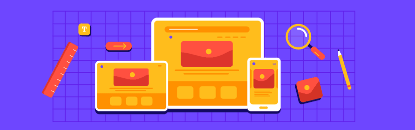
Websites designed with a responsive view can easily adapt to different screen sizes. This ensures that your website is readable even with changing screen sizes and technology. Responsive view optimizes the user’s browsing experience for their device — whether it’s a touchscreen or a wearable or a simple tablet, the user is greeted with a clean, easy-to-understand website.
Marcott advises designers to integrate flexibility and a shared experience into their website design:
“Rather than tailoring disconnected designs to each of an ever-increasing number of web devices, we can treat them as facets of the same experience. We can design for an optimal viewing experience, but embed standards-based technologies into our designs to make them not only more flexible, but more adaptive to the media that renders them.”
The Importance of Responsive View
While it may seem unnecessary, the better designed your website is for different mobile devices, the more users you can reach. Responsive view uses a mix of flexible grids, layouts, and images, coupled with smartly designed CSS media queries. This means that any well-designed website should be compatible & accommodating as the user switches devices.
For instance, your website should be able to automatically switch from an iPad view to an iPhone one, accomodating for the change in screen size and scripting abilities in a moment. The website should also be designed keeping in mind people’s desires to rotate their view and browse in landscape/portrait modes.
In the last ten years since Marcott first wrote about the growing demands for responsive design by clients & companies, we have more devices and different technology, necessitating mobile-first designs.
Google’s Mobile-first Indexing
If you want your product or website to be found on Google, then you should know that Google now follows mobile-first indexing. This means that it crawls, indexes, and ranks the mobile version of a site before the web version.
This means that all your efforts to increase your search engine rankings or to market your product on Google are futile if your website isn’t designed responsively. Responsive design brings users to your site, increasing your domain ranking and overall discoverability.
Developing Mobile-First Design
Mobile-first design is when a product is first designed for a mobile phone browser. This means that the website is developed with a basic outlook in mind with the necessary functions and features. The second step is to then develop this design into a more advanced version for PC/tablet browsers. This is called Progressive Advancement.
Progressive Advancement lets designers build features that can easily be integrated into PC browsers, reducing the overall impact and strain that may be felt during Graceful Degradation. This is because if designers began with an advanced version of their product, the mobile version often ends up being a watered-down version due to the reduction of functionalities to fit mobile devices.
Graceful Degradation is another way to go about developing web design. This is when the product or website is first designed for the PC/desktop web browser and then it’s functionalities are reduced until it’s compatible with mobile devices and their comparatively simpler browser abilities.
How ruttl Can Help You Design Responsive Websites
We’re building an intuitive web design tool that lets multiple team members collaborate on web projects and leave feedback on live website. Designers, developers, content writers, managers, as well as clients and stakeholders can work in tandem to develop sleek & beautiful designs that are optimized for both desktop & mobile devices.
ruttl’s ‘Responsive View’ feature lets you view your website on a mobile screen, and edit content on live website. You can use various other features of ruttl to adjust screen resolutions, image sizes, and other elements to craft a perfect mobile-first version of your product. Oh, and did we mention that it’s all with the click of a button and without any need for coding knowledge!
This ensures that your websites are correctly optimized for mobile devices and automatically adjust to your user’s screen preferences.
Eager to try out ruttl for yourself and see the magic? We’ve begun handing out beta keys to our early users. Sign up below.
To know more about how design can improve your product, follow us on social media for tips & tricks about UI, UX, design, and more.
[Twitter](https://twitter.com/RuttlApp “Twitter”) | [Instagram](https://www.instagram.com/ruttlapp/ “Instagram”) | [LinkedIn](https://www.linkedin.com/company/ruttl “LinkedIn”)