Microinteractions are the tiny yet mighty touchpoints within user interfaces that shape our digital experiences. It's the click that feels right, the swipe that satisfies, the animation that delights. These small design elements have a notable impact.
Nearly four out of ten users will only engage with a website with good design or content aesthetics. On the other hand, a favorable first impression can enhance overall user satisfaction by as much as 39%. Microinteractions can craft a memorable first impression and entice users to engage further.
These moments hold the user's journey together. They guide them with subtle cues and rewarding interactions that make a digital platform feel intuitive, responsive, and human. They are the difference between a good user experience and a great one.
This blog offers a comprehensive look at microinteractions. We'll guide you through the subtle yet significant impact of microinteractions on users.
Types of Microinteractions
Microinteractions are the core elements that facilitate user engagement within a digital interface. They come in different forms, each serving a unique function in enriching the user experience.
- Feedback microinteractions
They are a critical form of communication between the system and the user. The system responds with a visual or auditory cue when a user acts. For example, the satisfying 'ping' when an email is sent or the visual ripple effect when a button is pressed on a touchscreen. These cues confirm to users that their actions have been received and processed, which is essential in creating a smooth user experience.
- Control microinteractions
These microinteractions give users power over their interface interactions. These include elements like toggle switches and sliders that respond to user input. They provide immediate control over settings or preferences. Users receive immediate, tangible interaction feedback when sliders move fluidly or switch toggle with a crisp snap. It enhances the sense of direct manipulation of the digital environment.
- Emotional microinteractions
They are designed to evoke a feeling or connection with the user. These might be whimsical animations, personalized greetings, or playful sounds that bring a human touch to a digital interaction. For example, when a user "likes" a post on Facebook, the thumb-up icon animates and pops on the screen and provides satisfying visual feedback. This tiny interaction reinforces positive feelings and encourages further engagement on the platform.
Each type of microinteractions plays a critical role in creating a functional and enjoyable user interface. With careful design, microinteractions can foster a deep connection between the user and the technology.
Significance in User Engagement
Microinteractions hold the power to transform a user experience from mundane to delightful. They reduce the disconnect between humans and machines, seamlessly integrating into the interaction flow.
These small design elements serve a dual purpose—they enhance usability while reducing user friction. A sleek animation when a task is completed, or a subtle vibration when an error occurs can guide and reassure users. It can make complex digital interactions feel effortless and intuitive.
The importance of trust in digital interactions cannot be overstated, with 94% of web designers agreeing that a well-designed interface fosters user trust. Moreover, 75% of users form opinions about a company's trustworthiness from its website design.
Microinteractions are critical in this trust-building process. They provide responsive feedback that reassures users their actions have been acknowledged. As a result, users engage longer and have more meaningful interactions with the site.
Consider the 'like' feature on social media platforms—a simple tap yields immediate visual and haptic feedback. It confirms the action and rewards the user, which has been crucial for the platforms' engagement metrics.
Another example is the 'pull-to-refresh' gesture on many mobile apps. This feature offers users an intuitive control mechanism that's both functional and satisfying.
Such thoughtful implementations of microinteractions enhance the immediate user experience and have a measurable impact on user engagement metrics. By encouraging exploration, reducing frustration, and rewarding interactions, microinteractions are indispensable in creating interfaces that users need to use and want to use.
Design Principles for Effective Microinteractions
Designing effective microinteractions is an art that requires adherence to certain principles. These principles ensure that microinteractions enhance the user experience without overwhelming it.
Consistency
Consistency in microinteraction design ensures a coherent and intuitive user experience. Consistent use of visual cues, animations, and feedback mechanisms across the interface helps users learn and predict interactions. It also reduces cognitive load.
For example, if a swipe gesture deletes an item in one part of an app, the same gesture should have similar effects in other parts. This uniformity builds a sense of familiarity and reliability.
Aligning with Brand Identity and User Expectations
Microinteractions should reflect the brand's personality and meet user expectations. If a brand is known for being fun and vibrant, its microinteractions should echo this with lively animations and playful sounds.
On the other hand, a business-oriented application might opt for more subtle and professional interactions. This alignment helps in reinforcing brand identity. It ensures that users feel a connection with the brand through every interaction.
Simplicity and Creativity
The balance between simplicity and creativity is delicate. Microinteractions should be straightforward enough to be understood immediately yet creative and sufficient to delight users. They should serve their purpose without unnecessary complexity.
A loading animation, for example, can be a simple circle or a creative representation of the brand logo. The key is to maintain functionality while also sparking joy and interest.

These principles guide designers in creating microinteractions that are functional and integral to the overall user experience. Designers can create appealing microinteractions by ensuring consistency and aligning them with the brand. They also need to balance simplicity with creativity for user engagement.
Microinteractions in Everyday Apps and Websites
Microinteractions are the subtle features in apps and websites that enhance user experience and interaction. They range from the celebratory animations in project management tools to the intuitive swipe actions in email apps and the expressive emoji reactions on social platforms. Here are some great examples:
Asana's Rewards
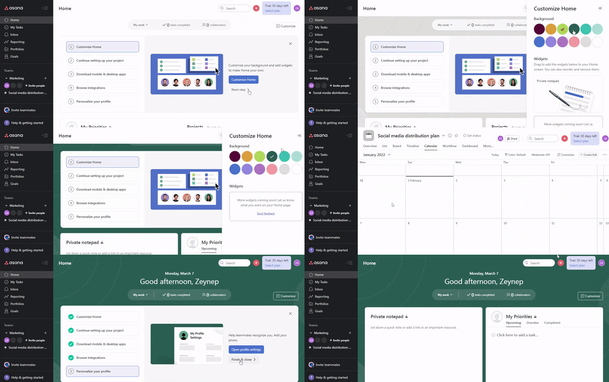
Asana's onboarding checklist transforms routine setup into a rewarding experience. It guides users to customize their workspace. Once the setup is complete, Asana celebrates this achievement with delightful animations of unicorns and other animals. It transforms the task completion into a moment of joy.
Key Takeaways
- Gamified checklists can drive user interaction and app exploration.
- Celebratory animations add delight and encourage task completion.
- Personalization of user experience increases satisfaction and product loyalty.
Other apps could use similar methods to foster user engagement.
Grammarly's Hotspots

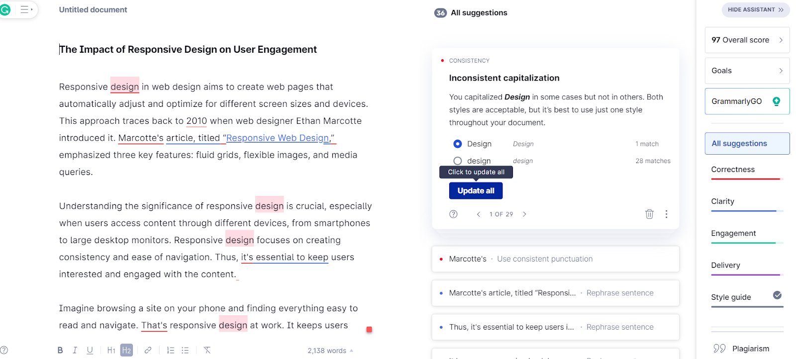
Grammarly's use of subtle hotspots during its onboarding process is an insightful illustration of microinteractions at work. These small, flashing icons spark users' curiosity without overwhelming them. They focus attention on critical areas, simplifying the learning curve.
When interacted with, these hotspots reveal additional information. It leads users naturally to the next steps in their journey with the software.
Key Takeaways
- Flashing icons attract attention without causing distraction.
- Interactive elements pique interest and encourage exploration.
- Transparent, incremental information supports user progress.
Incorporating thoughtful microinteractions can significantly improve user experience. They blend instruction with engagement to enhance digital interaction.
Email Swipe Actions
Swipe actions in email applications are a prime example of microinteractions that enrich everyday digital tasks. These actions enable users to archive, delete, or mark emails as read with a quick swipe. They make email management more efficient and enjoyable.
This simple gesture-based control cuts down on the time spent organizing emails. It leverages the intuitive behavior of swiping, which smartphone users have come to understand naturally.
Key Takeaways
- Swipe actions simplify email sorting.
- Intuitive gestures align with natural user behavior.
- Swipe settings can often be customized, catering to individual preferences.
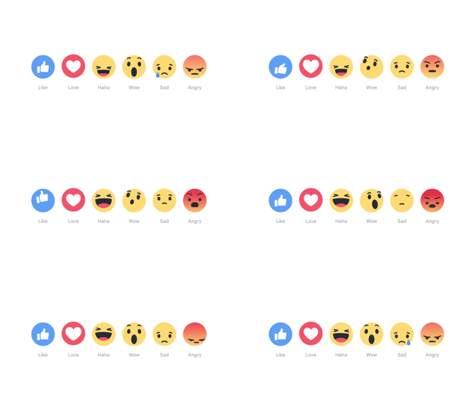
Facebook's emoji reactions are a clever use of microinteractions that enable users to express a range of emotions toward content quickly and easily. Beyond the simple 'like,' these emoji reactions provide a more nuanced way to respond. They enhance user interaction without cluttering the interface. These emojis offer a visual and emotional shorthand that enriches communication and reflects a spectrum of user sentiment.
Key Takeaways
- Users can convey complex emotions swiftly.
- A more comprehensive array of reactions encourages more frequent interaction.
- This feature keeps the interface clean while adding depth to user responses.
The Psychology of Microinteractions
The subtle yet powerful influence of microinteractions on user experience is often underestimated. Here's a deeper look into how these design elements can shape user behavior and perception.
App Abandonment and User Psychology
Microinteractions directly impact the user's initial experience with an app, which can affect the app's abandonment rate. As per stats, 21% of users abandon an app after one use. These numbers highlight the importance of engaging users from the outset.
Creating Responsive Experiences with Microinteractions
App responsiveness exceeds quick loading times; it encompasses the app's ability to acknowledge user interactions. Microinteractions serve this purpose by providing users with immediate feedback. When users feel their actions are instantly recognized, it creates a smoother and more intuitive experience. For instance, visual cues like a button's color change on interaction confirm the user's action without delay.
Emotional Connections Through Thoughtful Design
Microinteractions can also be a bridge to forming an emotional bond between the user and the interface. Thoughtfully crafted microinteractions can make the user feel cared for as if the app understands and anticipates their needs. This emotional investment can turn a mundane task into a delightful experience. It can increase the likelihood of the user returning to the app.
Microintercation's Impact on Onboarding
The onboarding process is where microinteractions can shine brightest. With Day 1 retention rates for Android and iOS apps hovering around 22.6% and 25.6%, respectively, it's clear that the initial user experience is critical. An onboarding sequence that utilizes microinteractions well can reduce the risk of app abandonment by making users feel welcome and guiding them quickly.
Microinteractions are essential in shaping the user experience. They provide feedback, enhance audience engagement, and create an emotional connection, which is crucial for user retention. Designers should understand the psychology of microinteractions to craft experiences that reduce abandonment and boost satisfaction.
Implementing Microinteractions in Different Platforms
Implementing microinteractions requires thoughtful consideration, especially when spanning multiple mobile, web, and desktop platforms.
Mobile App Microinteractions
Microinteractions can significantly enhance the user experience on mobile apps. 51% of smartphone users discover new products or companies through searches. Well-designed microinteractions can improve user engagement—a factor Google's algorithm considers for SEO.
For instance, consider the animated feedback a user receives when adding an item to their cart in a shopping app. This feedback is visually pleasing and confirms the action, encouraging further interaction. This type of positive reinforcement can increase users' time in the app.
Web and Desktop Microinteractions
On web interfaces and desktop applications, microinteractions must be adapted to different user behaviors and expectations. For instance, hover animations can guide users on desktops. It can provide subtle feedback and visual interest.
Take LinkedIn's notification icon, which exhibits a subtle bounce effect when new notifications arrive. This draws the user's attention and provides a satisfying interaction without leaving the current page, promoting continued engagement.
Cross-Platform Design Considerations
Designing microinteractions for cross-platform use presents both challenges and opportunities. Maintaining consistent functionality and customer feedback across different devices with varying input methods, screen sizes, and capabilities is the main challenge.
A solution is to design microinteractions that are adaptable, such as responsive button animations that work with both touch and mouse clicks. An opportunity in cross-platform design is the ability to collect user feedback from multiple sources. It can inform the refinement of microinteractions for a more unified customer experience.
Implementing microinteractions across different platforms requires an understanding of each platform's nuances and the users' needs.
Measuring the Impact on User Satisfaction
- Measuring the impact of microinteractions on user satisfaction hinges on direct feedback and data-driven insights.
- User feedback, gathered through surveys and direct user testing sessions, offers qualitative insights into the effectiveness of design elements.
- Usability testing explicitly allows designers to observe real-time interactions. It provides a clear picture of where microinteractions succeed or fall short.
To quantitatively assess microinteraction design, key performance indicators such as user engagement time, conversion rates, and app retention rates are invaluable. A rise in these metrics often correlates with well-received intuitive design improvements.
For instance, increased user retention may result from a streamlined checkout process enabled by effective microinteractions.
The design process for microinteractions is iterative. It relies on continuous user response and data analysis to refine the user experience. Designers and developers must be agile and ready to tweak. They must enhance microinteractions based on user data to ensure the continuous improvement of user satisfaction.
Future Trends in Microinteraction Design
The future of microinteraction design is set to be transformed by emerging technologies. These technologies can lead to more intuitive and immersive user experiences.
- Influence of Emerging Technologies
Augmented reality (AR) and virtual reality (VR) revolutionize microinteraction design. AR, for example, enables new types of microinteractions that blend the physical and digital worlds. It allows for more natural and intuitive responses to user actions.
Haptic feedback technology is another area that enhances microinteractions by providing tactile responses. It adds another layer of interaction that goes beyond visual cues.
- Trends in Microinteraction Design
Anticipated trends in microinteraction design point towards personalization and context-aware interactions. As machine learning algorithms become more sophisticated, microinteractions will likely become more adaptive. This personalization will make user experiences feel more tailored and engaging.
- Shaping the Future of User Experience
Microinteractions are now key to refining user experience design. They shape how users feel and interact with technology. As interfaces become more complex and feature-rich, microinteractions simplify interactions and make technology more accessible. The future will likely see responsive yet predictive microinteractions. These will guide users through their digital journeys in an effortless and intuitive way.
The evolution of microinteraction design is poised to make our interactions with technology more engaging, personal, and satisfying.
Conclusion
Microinteractions serve as the subtle yet impactful elements that significantly enhance user engagement. They guide users through tasks and improve their experience. They acknowledge user actions by providing immediate feedback. This keeps users informed and in control.
Designers take note: focusing on these details pays off. Microinteractions turn mundane tasks into enjoyable experiences. For example, a playful loading animation reduces perceived waiting time. A subtle sound confirms a successful action. These elements add personality to your product. They make it more relatable and memorable.
Incorporating microinteractions should serve a purpose: guiding users, preventing errors, or simply bringing joy. This approach can transform user experiences from satisfactory to exceptional.


