BlogDesign

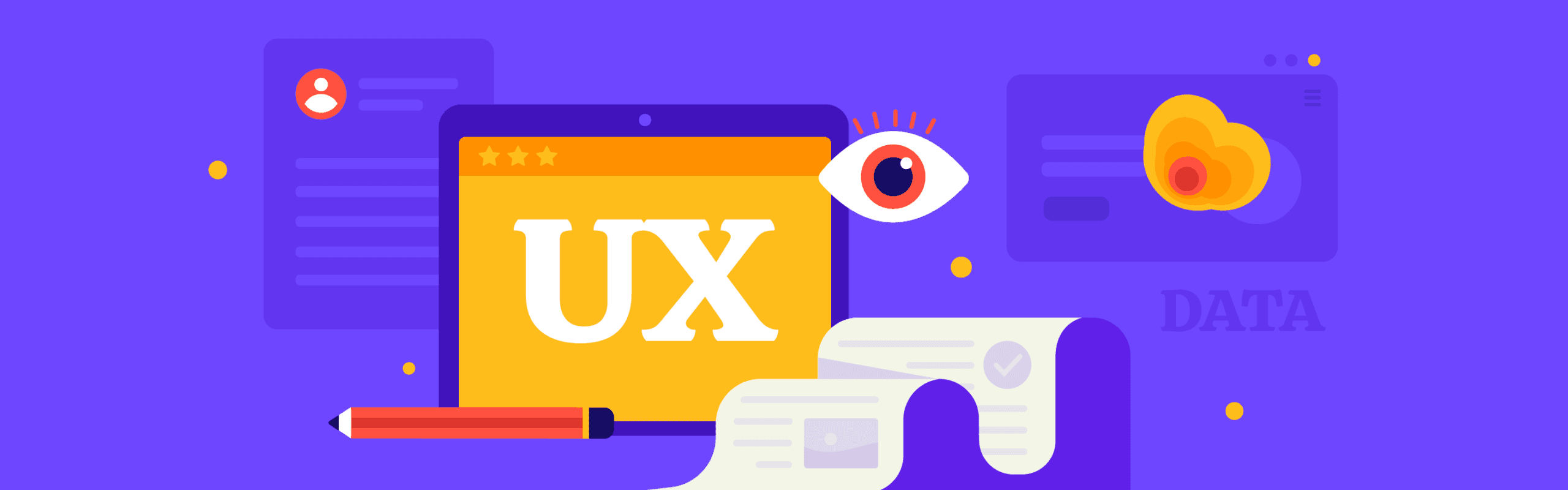
12 Awesome UX Design Examples To Copy in 2024

Written by Siddhita Upare
Published on November 8th, 2022

Get started with ruttl for free! 🙀

Get Started

User experience (UX) has gone mainstream. Companies now realize its importance and invest millions in hiring UX teams and getting perfect design styles.

A good UX can increase your conversions by up to 400%, make 74% of people return to your website, and generate an ROI of 9900%.

We know that's an insane number to digest, but it's definitely true.

User experience can either make or break your relationship with your customers. Thus, it's crucial that you spend time understanding what design trends work for your brand or take inspiration from those already acing the game.

So, here we are with some of the best user experience (UX) examples we've seen in recent years. At ruttl, we have a team of excellent designers that have helped us filter out the best UX designs available on the internet.

These designs are so good that you might not have even noticed them but surely have enjoyed the experience.

Let's get started.

What is UX design?

Steve Jobs once said,

"Design is not just what it looks and feels like. Design is how it works."

And that's exactly how you can define UX design.

It refers to how users interact with your product or service. UX design includes each element that makes people's experiences smoother and helps them quickly complete the desired tasks. UX designers build a bridge between user expectation and design style that makes the end-user expectation pleasant.

If we are talking about UX design, it's mandatory to discuss UI.

UX and UI are most often used interchangeably when they are quite different. The UI is a part of the UX and not vice-versa. UI refers to the interface of your product; buttons, icons, toggles, and other visual elements you interact with on the website, mobile, or web app.

UX designers combine product development, user research, strategy, and design to create a seamless user experience for customers. They are responsible for creating a solution that acts on the pain points from the user's first encounter to the last.

UX design is applicable to both physical and digital products. For instance, when using a physical device like a mobile phone, users analyze how it feels when they hold it or if the weight is too much for them.

Similarly, when using a digital product, customers' decisions are based on its ease of use, loading speed, or visual properties.

UX designers go beyond UI to ensure that they delight users and make their interaction with the product as seamless as possible.

Why is having a good UX design important?

If you are still wondering what great UX design can do for your business, then let's discuss some of its benefits.

Almost all first-impression of your users with your product is design-related. In fact, 75% of users form an opinion on the website's credibility based on its aesthetics. Your UX design helps improve the reputation of your brand. They make your users feel comfortable with your product with excellent visuals and intuitive navigation, making it easy for users to complete desired tasks.

Studies have proven that companies with good UX design see lower support costs and customer acquisition costs. It reduces the unnecessary burden on your support team to guide users through performing tasks. So, when you make navigation simpler, you are reducing the need for people to reach out for every small process.

Good UX design improves customer loyalty and makes people come back for more. Satisfied customers will also most likely recommend your product or service to their network.

Good UX design decreases the number of steps in completing a particular task. That leads to people achieving their goals quickly and not getting frustrated. A higher number of steps will do just the opposite and make your customer go away.

Businesses are always on the hunt to stand out against their competitors, and a good UX design does just that. If your platform is user-friendly, loads faster, and is easy-to-navigate with top-notch design elements, your business already has a competitive edge against your competitors.

What makes a good UX design?

There is no right answer to this question. User experience is different for everyone. The only thing to remember is to keep your users' needs in mind. Don't assume that you know everything they want.

Here are some basic elements to creating a brilliant UX design-

1. Simplicity

Your UX design must be super simple so everyone can easily use it. If your product is over-complicated or requires a lot of steps to complete every task, your customers probably won't be happy. Besides bad UX, a lack of simplicity can also arise in the case of technical issues or bugs.

2. Usability

Usability is often interchangeably used with simplicity. It refers to the extent a product can be used to achieve specific goals. From the user's point of view, usability is important for them to accurately complete their tasks without feeling stupid. Poor usability reduces productivity and makes every process tiresome. To improve usability, frequently conduct user testing where you evaluate your users' performance based on how quickly they accomplish their tasks.

3. Visual design

A great UI is as important as UX. Your product might be brilliant, but if it doesn't look good, it doesn't have a chance in this competitive marketplace. Ensure your product looks aesthetically pleasing and consistently keeps users on your platform. A good UI follows the visual design principle of keeping all elements' lines, color, shape, and space together.

Good UX design examples for inspiration

This should be your go-to list if you are looking for a full-proof way to create excellent UX design for your product. In addition, this UX design examples list contains brands that have successfully impressed their target audience with their design solutions.

1. ruttl

You might feel this is biased, but it's not. Just hear me out.

We have spent a good time building ruttl and are super proud of it. Our design team works every day to make it better on UX designs, visual hierarchy, and usability. And, there are features on ruttl that are unique and will surely add value to this blog.

ruttl is heavy on illustrations. Since we are a feedback product, users need to know what we do. Therefore, we have added small illustration gifs in every section to give particular attention to all the points.

ruttl's website is visually appealing, with the right color palette that makes the interface delightful to surf.

Our onboarding to project creation process is literally two steps. There are no unnecessary steps that users have to follow to get started. When you sign up, you will see that projects are bifurcated into three categories: website feedback, bug tracking, and other web app projects.

Working in ruttl is quite straightforward with no learning curve. So, even if you have no tech knowledge, you can still use ruttl smoothly.

2. Duolingo-Gamification with learning

Duolingo is a lifesaver for people who want to learn new languages on their own. This language-learning platform has over 150 million users registered worldwide, and it is one of the key language-learning apps in the market.

But that's not the only cool thing. Duolingo has a great UX and uses gamification for users to stick around longer. The biggest challenge for Duolingo is that it offers courses in 23 languages, but the app itself has to have a universal tongue.

Despite this, Duolingo seamlessly juggles between languages according to its users and provides an excellent app experience.

From the user onboarding, you will continue to see a visual hierarchy where Duolingo breaks down complicated topics into chewable visual treats, making the overall learning experience pleasant.

Duolingo's learning methods contain a lot of visuals to help users easily understand the topic. The UX designer has excellently used gamification methods to keep users engaged and motivated to go further. The UI is simple and focuses on one element at a time to reduce the user's cognitive load.

3. Apple-Simple but modern design

Apple is one of the biggest technology companies in the world and can make any design mainstream. The website is heavily loaded with high-quality pictures and graphics; despite this, its navigation is smooth. You will rarely see Apple's website lag or be difficult to understand.

Check out its navigation bar.

Apple doesn't have any drop-down menus. Instead, it makes the navigation process simpler by asking users to focus on a specific product and then showcasing its submenu through icons to improve the UX. As a result, there is no learning curve; even new users who don't know much about Apple products can easily navigate through each of its products.

For Apple, less is more. No crowded subpages, many CTAs, exaggerated information, or strong contrasts that can confuse the user. It believes in simple and modern design. The Apple website looks quite modern with minimalist colors, white backgrounds, and graphics.

4. Airbnb- Straightforward booking experience

Even in such a competitive market, Airbnb still stands out because of its simple UX. The app has a straightforward UX design, you come on the interface and start searching for stays. No login, no multiple pages, just a simple search bar that lets you do what you are here for.

The navigation bar of Airbnb is similar to that of Apple. It has no drop-down menus and represents all its Airbnb options through icons. The ease of use and the ability to tailor options and find the right information are examples of good UX.

The Show map feature is unique to Airbnb; it lets users see and compare the prices of all Airbnbs on a single map.

The Airbnb website offers a holistic experience that includes everything a traveler would search for. It contains information about the host, the properties, amenities, and the booking date.

5. Netflix- Personalisation at its best

Netflix is a prime example of great UX and uncluttered UI. Right from the very beginning, you will see a clear interface with minimal design and copy whose main aim is to get signups.

According to your location, you will see a background full of shows that are popular among your people. So, even if you were confused about what you would see on Netflix, the app gives a preview.

Netflix has always believed that less is more. The website only markets features that will entice users to sign up. Simple and on-point copy contributes to Netflix's success.

The onboarding experience is seamless, with limited questions and the ability to create various profiles. Each user can create a maximum of five profiles under their Netflix account, and all of the profiles will be treated as unique.

After creating an account, Netflix will ask you to pick which films or series you want to view. This information is further used to analyze users' preferences and offer them a personalized experience.

6. Spotify- Device optimization

The music streaming market is quite exhausted with some clear players. Despite this, the Spotify app continues to shine with over 299 million users. Most of its success goes to its easy-to-use and delightful UI and UX.

The dark mode is quite mainstream now, and Spotify has maintained this interface since its inception.

Spotify's interface is optimized for viewing on laptops, mobile phones, and cars. The desktop interface is uncluttered, and all elements are neatly arranged. Similarly, the mobile interface has been modified with a horizontal view design element for the best user experience.

The car view of Spotify automatically turns on while driving. Its interface is clean with the song name, play/pause, and next/previous buttons. This instantly increases clarity for someone viewing it only for a brief moment.

Spotify has also given utmost attention to personalization by understanding users' song selections and creating daily mixes that match their playlist vibe.

7. Amazon- Easy-to-use interface

Amazon is a pioneer in e-commerce. Its functional and accessible website makes it stand out from the competition. A recent survey by Visual Objects claims that "Amazon has the most appealing UX, according to most generations."

The most prominent UX features that users are most attracted to are:

Easy to use search bar.

The search results are easy to navigate.

The filters are quite helpful in the search process.

It offers an overall personalized experience.

Since its inception in 1994, Amazon UX has changed largely. The UX design team has focused on improving the user's experience. Continuous change in graphics, colors, and tabs has resulted in Amazon's transformation and contributed to its success.

The search bar makes it super easy for users to get their desired products. You can type keywords related to a topic and get similar products that you can purchase. The user-generated reviews and ratings add a lot of credibility to the product.

Amazon also recommends products that gel well with your order for a personalized experience.

8. Instagram- All about usability

Instagram has been popular since its origin in 2012. But, the major reasoning of why people loved using it was because of its easy-to-use interface. You click a picture, edit it, and upload it.

It was that simple.

The Instagram app embraces all five categories of usability: efficiency, memorability, errors, and satisfaction.

The onboarding process of Instagram is short and effective. There is not much of a learning curve, and most users easily learn their way through using it. Instagram's interface also teaches new users about its features, so there are mostly no issues regarding learnability.

The Instagram app is available on all desktops and the web. The buttons on Instagram are mapped out to support the natural way of holding your phone. Such small things make users easily surf the interface and promote user retention.

Each element in the app is super-consistent that it doesn't dilute the interface and ensures users can use it regardless of which device they are logged in to.

9. Paypal- Decluttered UX

Paypal is not the first site people think of when it comes to UX design. However, Paypal has come a long way and has updated its site multiple times for the better. If you think that only small businesses mess up with bad UX, then you are wrong.

Paypal's initial website was cluttered with so much information that it was challenging for users to navigate the site.

But now, instead of tabs, they use text for the top-level navigation. They include drop-down menus to cover sub-navigation.

The onboarding process has a well-planned flow and very limited steps, so it's easy for users to get started. The mobile and website apps are clear in design with no unnecessary fancy graphics or features.

10. Starbucks- Loyalty reward app

In 2018, the Starbucks app was the most used loyalty reward app (48%). Over 30 million users have used Starbucks to order food and beverages. The loyalty program aimed to make customers come back for more while stacking up rewards.

The difference between Starbucks and other apps was that customers could track the reward points they would receive if they ordered a particular item. The points were further automatically added to their "Star balance." It required no effort from the user's end. They also launched "personalized challenges" for users to entice them into points faster.

Starbuck uses "smart personalization" in their mobile app to understand the user's taste and ordering patterns. It encourages additional products according to your food history and rewards gained. They also suggest locations where users can come and pick up their orders.

11. Bumble- Sleek and understandable design

Bumble app is a popular dating app. The twist is that only women can make the first move. This gimmick got Bumble over 7 million users, despite being quite similar to Tinder.

The user onboarding is simple and straightforward with a well-crafted short-conscious "call-to-action." Most apps let you create a user account via Gmail or simple email and password, but Bubble does not. You can only log in with an Apple ID, Facebook, or phone number. This is specifically done to limit bots and low-quality matches for its users.

To simplify, Bumble adds a wordy confirmation as users take action. For instance, "Swiping picture to left means you are not interested" or "Swiping picture to right means that you want to connect."

Users can also personalize their matches by adjusting the distance, age, and gender of their matches. The UX of Bumble is quite sleek and tidy, and anyone can easily navigate through the platform.

12. Rover- Booking made

Rover is a unique website that connects sitters and dog walkers with pet parents. It is dedicated to making pet care safe and affordable.

Rover has an accessible UX design with a visual hierarchy that makes it easy for users to navigate. Getting started on Rover is a simple process where you upload pictures of dogs or cats and write about your experience working with pets. Once done, your account will be set up to receive pet service.

And, it's quite easy to find pet walkers if you are a pet owner. Just select your service, your area, and the size of the pet. You will get a list of pet walkers with whom you can chat and book your service.

Wrapping Up

It's easy to get carried away with such profound names, but remember that even they had made some huge UX mistakes before being listed here. The best way to improve your UX is to get regular feedback from your audience and then identify opportunities for feedback.

One way is to directly ask them using a standard customer feedback tool. Such tools help collect information on what your customers like and what they don't like about your product.

ruttl is an excellent customer feedback tool that lets you collect precise and detailed customer reviews to offer the best customer experience to users. You can easily send shareable links to your customers' web pages and let them give their honest feedback.

ruttl can reduce web app review time by half, which means quicker feedback, and a better user experience on the site.

Sign up to get started.

20,000+ companies are using ruttl to save time and money on their projectsstock images of people in a row