UI/UX is more than just designing. It's the psychological art of truly understanding the user.
While working on design projects with clients and while building ruttl, I particularly came across an interesting psychological concept in design called "Gestalt Laws of Perceptual Organization". ☁️

Don't get scared with the big terminology!
In order to help you guys understand this important concept, I though of explaining them in the simplest manner possible.
Although there are more ideas involved in the Gestalt Laws, I've choose to include the ones I worked closely on. 🙌
1. Law of Proximity
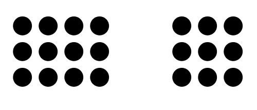
When we similar things near each other, they seem to be grouped together. For instance, you would a bunch of dotted column lines as a square if they are placed together closely.

2. Law of Pragnanz
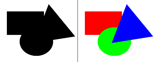
Complicated figures will appear simplified to the human brain. So, if you were to see multiple geometric shapes overlapped, you would see the shapes directly instead of an abstract figure.

3. Law of Continuity
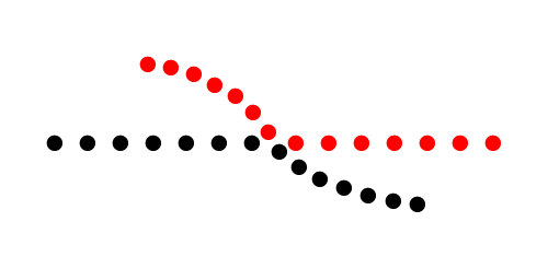
If you have bunch of dots in line, you would be able to visualize the continuous, curved line in the smooth manner like you normally would.

I hope you guys found this useful!
Have a great day ahead! 💯
