Several studies have explored the impact of different colours and different types of colours on human beings. This field is called colour psychology, and designers can leverage several valuable bits of information when choosing colours for website design projects.
On a superficial level, people associate colours with prominent brands, i.e. colour branding. Colours can increase brand recognition by 80%. When it comes to web design and playing with saturation and brightness, the impact on user experience can be pretty striking. Employing design thinking to anticipate user journeys and user behaviour can help designers highlight relevant sections & CTA buttons through the right colours.
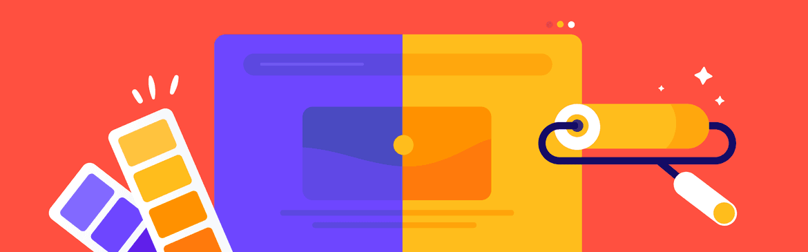
Brightness vs Saturation
Have you ever landed on a website that’s almost too bright to look at for too long? Websites that have increased the colour brightness on their elements, CTA buttons, and text are attractive at the start but soon cause overstimulation in the retinas, reducing our tolerance.
Similarly, sections that are fully saturated draw attention but cannot sustain it. They disrupt the user experience and, if placed in large sections, drive the user away.
Saturation refers to the intensity of a colour, i.e. the amount of grey mixed into it. Brightness, on the other hand, is the amount of black or white in the colour. Web designers need to balance the two in small sections to draw attention and enhance user experience.
Bright desaturated colours are considered more friendly and professional, especially when gradated. `For instance, when Brucira designed BlueSapling’s website, we chose bright colours to maintain the brand tonality and vitality across our designs.
On the other hand, darker desaturated colours, like the ones we used in the Easy A Tutor Dashboard, are considered more serious and professional. Most industries pair darker colours with more vibrant ones for contrast and to keep the user engaged.
Where should you use saturated and bright colours?
If your entire website is bright and saturated, it’s hard for the user to read any copy or check out any visual information presented about your product. Use bright saturated colours in the two ways we suggest below:
Highlight sections
Desaturated colours are often chosen for panels, backgrounds, and menus to reduce user flow breaks. It’s easy to find when needed but not in your face otherwise. That’s why it’s a good idea to use saturated and bright colours to highlight important sections on your web page. Use colours to make these elements stand out and guide your audience to them quickly.
Create prominent CTAs
If you pay attention, all the CTA buttons you’ll come across are bright and saturated. If you haven’t noticed it yet, you can check out the colour of the “Share” button on Google Docs as an example. Website designs that balance white space and saturated colours through their buttons draw the user and increase their conversion chances.
Another reason to place your CTAs in a bright coloured box is to help your users find them easily. As they scroll through your webpage, make it easier for the user to contact you, sign up, or learn more about the product or service. This will improve your overall UX (user experience)and contribute favourably to your website’s UI (user interface). The UI determines user journeys, and correctly colouring CTA buttons will only boost your website’s functionality.
Things to remember when choosing colours for your website
Here are a few pointers to keep in mind as you select the colours to define your brand and your website. Remember, colours affect our perceptions subconsciously, so choose wisely.
Research, research, research
Conducting competitor research to find out the dominant colours across your industry is a great way to set the right tone for your website. For instance, when we worked on Eugenie.ai’s website redesign, we spent a lot of time researching the industry standards and how to make the website stand out with our designs.
Use colour to connect & share information
Ask yourself, do the colours help your audience connect with your brand and your products? Choose colours that favourably impact audience perception. Next, it’s essential to ensure that all the time you spent crafting the perfect lines for your website copy to inform your audience about your products and service isn’t going to waste. Don’t choose the wrong colours or place brighter colours in the wrong sections. Make sure the text on your website can be easily read, especially in saturated sections.
Create a brand colour palette
There’s no rule that you have to stick to the same colours your competitors are using. Choosing different colours can draw more attention and keep your user engaged. Remember to create a clear colour palette for your website, so all the illustrations, graphics, and elements are coordinated to give it a cohesive look.
High-quality UI vs simple UI
Fancier colours suggest a better user experience, while basic colours imply a low-quality or simple user experience. Complex, shaded, and graded colours make the user perceive that the website, and in turn, the product is high-quality since it seems professionally made.
There are exceptions to the rule: Google’s simple colours, Coca Cola’s signature red, or Nike’s black and white — these companies use simple colours in their logos and across all their marketing collateral, even their websites. So, when choosing your brand colours, keep in mind the way you want your brand to be perceived.
Review website designs to get the perfect colours
Reviewing website designs needn’t be time-consuming and stressful anymore. As a product design agency, we recognized the need for a visual website feedback tool decided to built ruttl.
ruttl lets you edit live websites, make font changes, move elements around, experiment with colours, and so much more. Web design reviews help you check if your CTA buttons are placed correctly and if they draw the right amount of attention from users. Similarly, you can check how two different versions of a website would look without coding knowledge with our version control feature.
Try it out with your next web design project at ruttl.com.
Follow us for more web design, UI UX, and product design insight at LinkedIn | Facebook | Instagram | Twitter