Whether for your clients or for your design agency, if you wish to make a mark with localization then you must create a multi-lingual website. In case you have already been doing that, then you need to put some thought to let your users intuitively switch languages on your website. Having been there and done that, we could say that it is an art and its rewards are many. As per the Localization Industry Standards Association (LISA), creating a multi-lingual website is a smart strategy - for every dollar that you spent, you could expect a 20 times return on it.
A language switch button is at the core of a multi-lingual website. It not only catches the eyes of your users but also retains them on your website through its intuitive user experience. Designing a language switch button is therefore crucial while creating a multi-lingual website. Let's take a look at the best design principles for creating it:
Using Language Switch with Icons
Think about a multi-lingual website and the first thing that could hit your mind is the language icon. Icons not only give a visual cue to your users, they also offer an intuitive user experience. Due to a lack of standardization, there is no fixed source for downloading these icons. However, you can check websites like Flaticon or Language Icon to find the perfect icon for your language switch.
Using Language Buttons

The U.S Web Design System has recently introduced a guide on web design standards and it has created a unique language switch by making use of a button component. If that complements your web design then feel free to use it.
Using Text Links

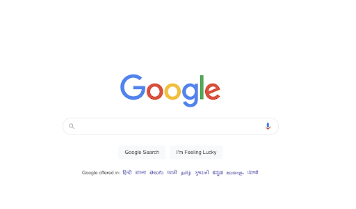
Thinking about creating a language switch with text links? Google will have your back. Language switch button with links is used by many global websites. Do consider it if you wish to make it easy for users to switch languages.
Using Language Switch in Navigation
A navigation bar is also a great place to embed a language switch. By embedding the language switch in the navigation bar of your website, you would make it simpler for users to find it and easily switch the language without trying to locate it across the website. Trello has done the same and it has proven to be effective for them.
Using Language Switch in Footer
Remember Facebook’s footer? We are sure you would recollect them placing language switch in their footers. There are many other websites that have been following this suit. If you are aiming to create a minimal, clutter-free website then think about placing the language switch in the footer, it will definitely make your website seamless.
Using Text-Based Language Switch
Last but not the least, always do user research and collect some feedback before designing a language switch for your website. Oftentimes, your users could incline towards a text-based language switch instead of the other options. Knowing this preference beforehand could help you save a lot of time and resources during the development stages.
Design Basics for Creating a Language Switch Button
- Language switches can be customized in various ways and they are vital for creating a rich user experience.
- Ensure that the visibility of your language switch is proper. Evaluate whether you wish to use flags or icons to increase it.
- Avoid using the initials of languages as they might confuse your users. For example, use Hindi instead of Hin.
- While language redirection can be one of those unique features of your website yet do not offer it at the cost of your language switch.
Importance of a Language Switch for User Experience
A language switch is the most important element to think about while creating a multilingual website.
If you end up using too many icons, flags or other visual elements then it could confuse your users and overwhelm them. Conversely, designing a seamless language switch would enhance the user experience for your repeating users and even the new ones.
