
Your website has multiple products, services and pages. How do you keep your audience hooked on one campaign or one goal? The answer is simple: create a high converting landing page. While it’s not exactly rocket science, it sure takes effort to design your landing page in order to get results. Ruttl brings to you 6 elements that will help you do the same.
1. Have an appealing main headline
A headline is what your visitor will see first. It’s important that your headline is catchy, clear, short and describes why the visitor will like to stay on your site. Here are 3 main things your headline should accomplish:
It should tell the reader what your product or service is about or its core benefit.
It should be attention catching.
It should ideally not be more than 15 words.
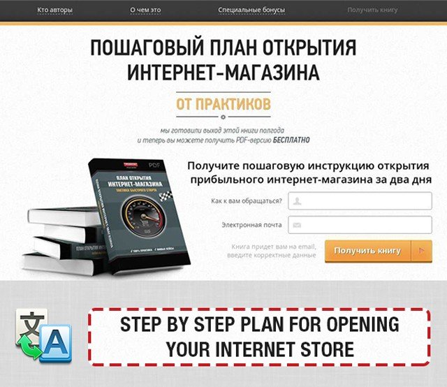
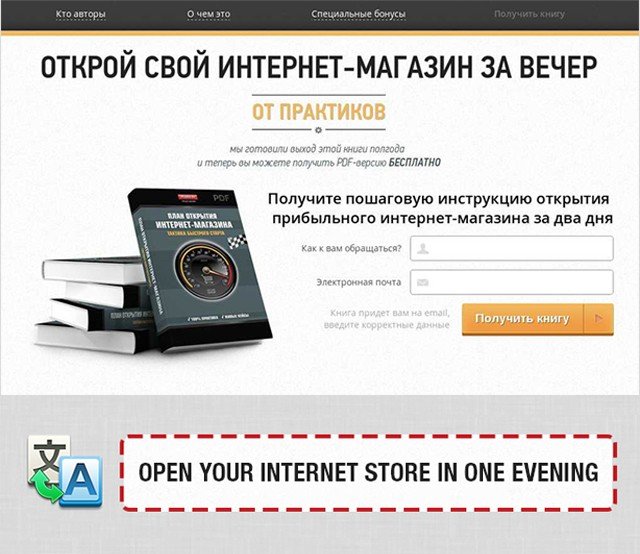
Just by changing their headline, Insider was able to generate 9.52% more leads on their landing page.
The first image shows the headline they already had and the second one denotes the variant they came up with after testing. Why did this work? (a) They promised an easy solution (b) They promised they could do it in less time.
Here’s another amazing heading by Conversion Lab that meets all the checkpoints.
2. Have a supporting heading
Can’t fit it all in your heading? That’s when a supporting heading can come to your rescue. Your supporting headline can go into more detail of what your product or service has in store for your visitor. It has some element of persuasiveness that encourages your visitor to take action.
Here’s an example from Hubspot. As it’s difficult to talk about all their products in the heading, they do so effortlessly in the subheading.
Remember, your subheading should achieve these 4 goals:
- Include your USP, if appropriate
- Encourage action with an engaging CTA button
- Keep it crisp and don’t overinform
- Make it longer than your main heading
3. Have a visual focus
Can you see what these two snapshots of landing pages of Perfect Keto and Casper have in common?
They have a visual focus. Even without reading the headings and subheadings, you can get an idea of what the product might be about. Considering that our brain processes visual information faster than text, it’s imperative to add some visual elements to your landing pages. The images or videos that you add should be relevant to your product or service, should be of high quality and be able to catch the visitor’s attention.
4. Show some social proof
How many times have you scrolled through the reviews before buying a product? Probably many times. Social proof consists of testimonials, reviews, number of customers, your most elite clients and social engagement. By displaying this prominently on your landing page, you can persuade your visitors to click on your CTA. Why? Because visitors are more likely to purchase from you if others have done so in the past and are happy with their purchase.
By adding a simple testimonial above a form, WikiJob was able to increase conversions by 34%.
Here’s one example of how Codecademy uses real life stories from different customers.
5. Introduce your key benefits
To inspire your visitors to take action and appeal to them, introduce your key features and benefits on the landing page. You can put yourself into the shoes of your customers and ask yourself, “If I buy this tool, how would it help me?” Those are your product’s prominent features that should appear on your landing page.
Instead of writing lengthy descriptions, be brief and break it down into short bullet points or a single paragraph. Here’s an example of how Smartify does this.
6. Have a powerful CTA
The CTA is the main element of your landing page. It’s why you have spent so much effort in creating your landing page. A good CTA fulfills three aspects:
- It ties back to the reason a person is visiting your landing page
- It clearly says what the visitor will get in return if they click on it
- It has a contrasting color or a different design that catches the visitor’s – attention.
Make sure you don’t go for the usual “Submit” or “Click here” texts. Make it a little unique.
Your landing pages will not be perfect on the first try. You may have to test different variations of it and then finalize the one that gets you the most results. To make the process of creating your landing pages and reviewing them much easier, try Ruttl, a website design feedback tool.
You can leave comments directly on live landing pages, inspect the different elements on it and collaborate easily with your entire team or client if you’re a website design agency.
Try it out here: ruttl.com
Follow us for more website design tips and tricks: LinkedIn | Instagram | Twitter
